Objective & Brief
Create a graphic identity system and appropriate collateral that establishes MeshBox as the leader in new emerging Interface Design Solutions on the East Coast. Position MeshBox as Epicenter for Innovation, and Cultural Appreciation for Design on the East Coast.
Business Overview
Mesh Box located in Raleigh, NC and is a medium-sized industry leading Interface Design agency on the east coast specializing in new and innovative design solutions for not only just mobile but web as well. We are focused on bringing interfaces, applications, web, and various digital interfaces closer to projected users in order to fit the cultural context in which the user lives. We do this by providing tactful, adaptive and intuitive design solutions to our clients. We believe at Mesh Box that no client should leave our firm unsatisfied with our final solution and as a company, we strive for quality craftsmanship which leads to consistent quality design. At Mesh Box we have a proven track record for providing not only just those qualities for our clients, but we also make it affordable.
Similiar Entities
Design Box, the assembly, willow tree, smashing boxes
Values
- We are focused on a culture in the workplace that has Collaboration, Communication, craftsmanship, and Optimism
- Provide a sense of Partnership and Communication between Design Firm and Community
- We are always personable and transparent to our clients along with the other values we value in the workplace.
Target Audience
Statewide Entrepreneurs and small to Corporate Businesses
Message
“MeshBox” wishes communicate its sense of innovation and Attention to detail in Mobile and Web Design
Tone
Defined by the following word associations
- Intuitive and Adaptive Interface
- Tactful and consistent personality
Ideation
Understanding the Company through Exploration
To better determine and understand the look and feel of the brand I began doing word associations and taking notes in my sketchbook as well as sketching preliminary logo marks on what I thought could make a stepping stone into the brand identity.
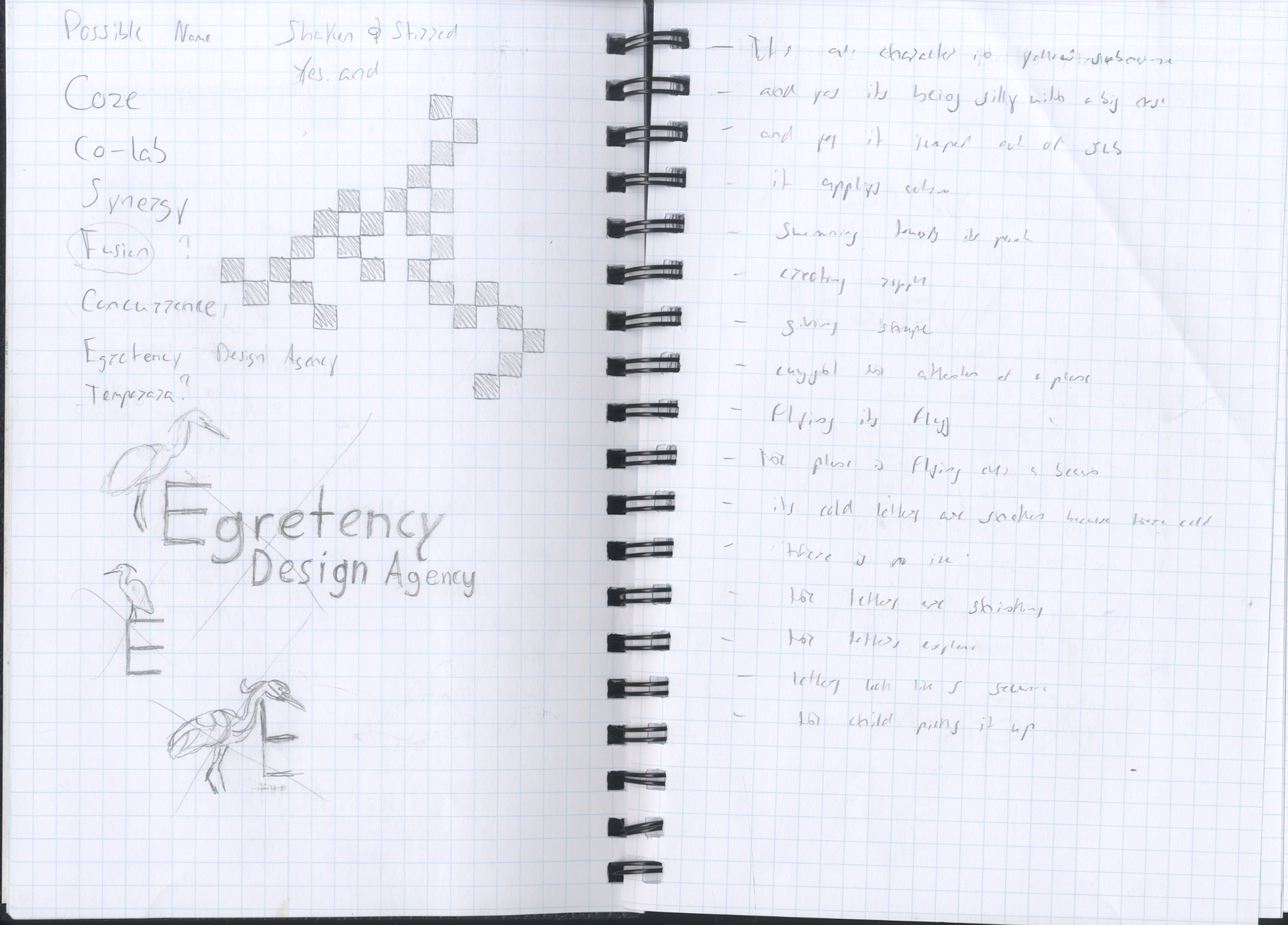
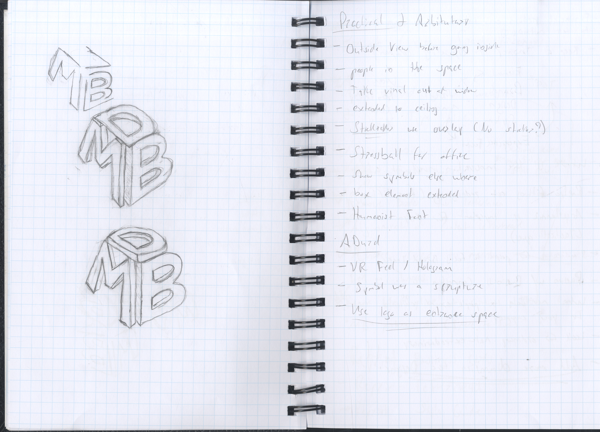
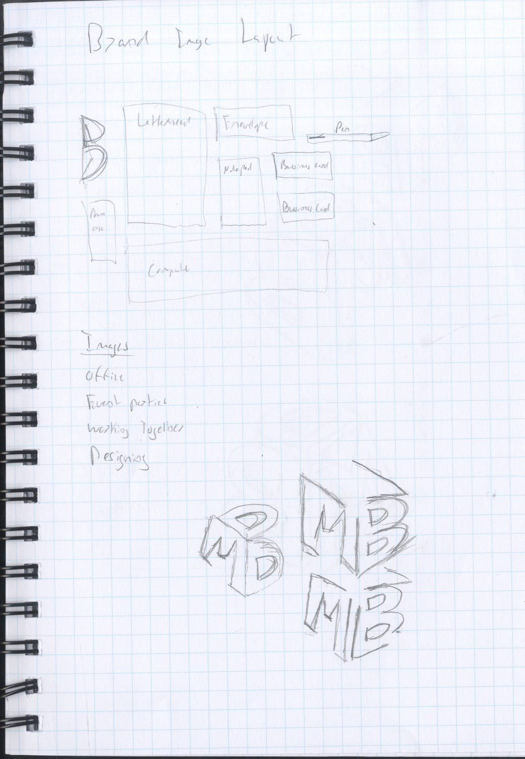
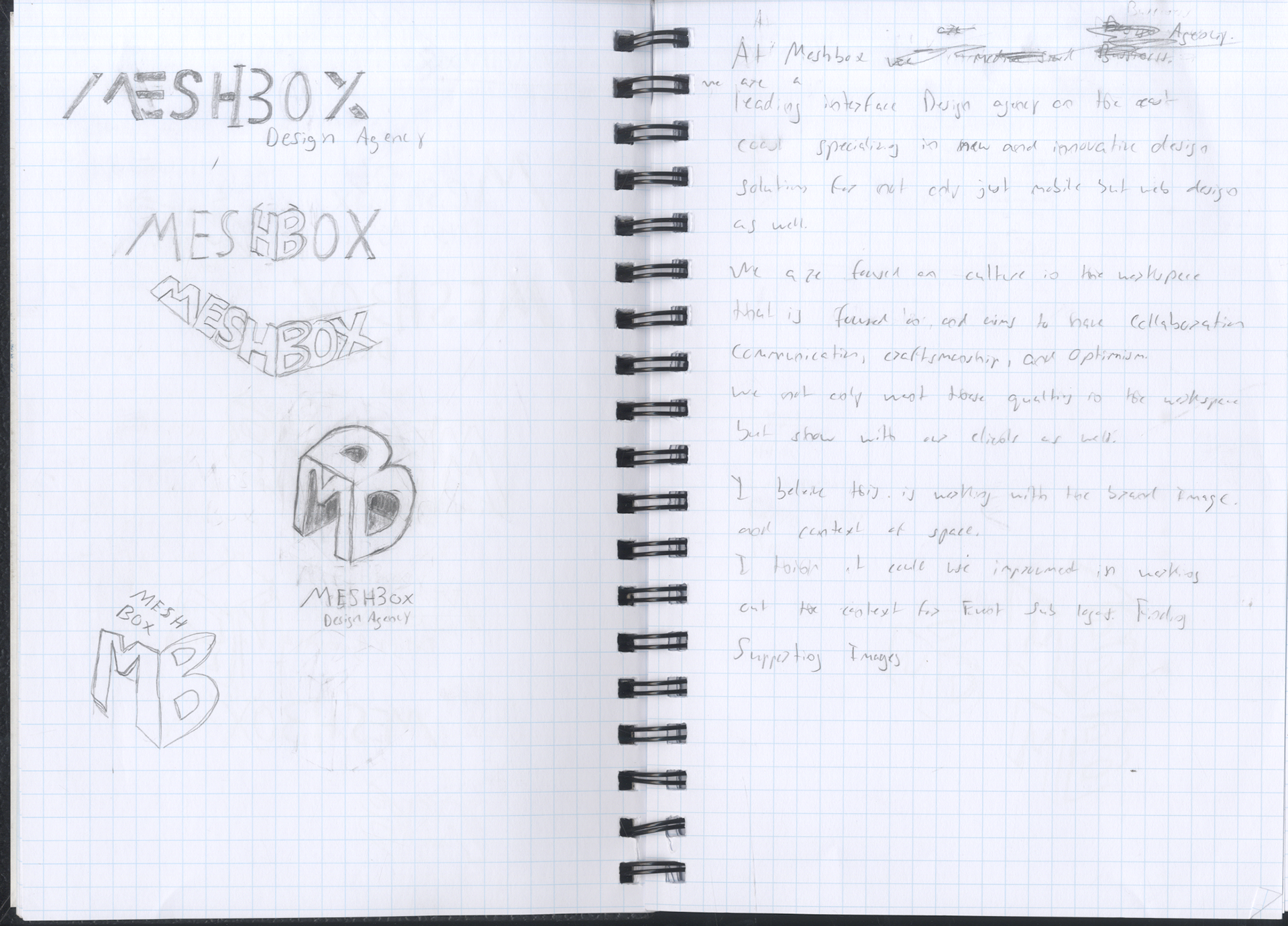
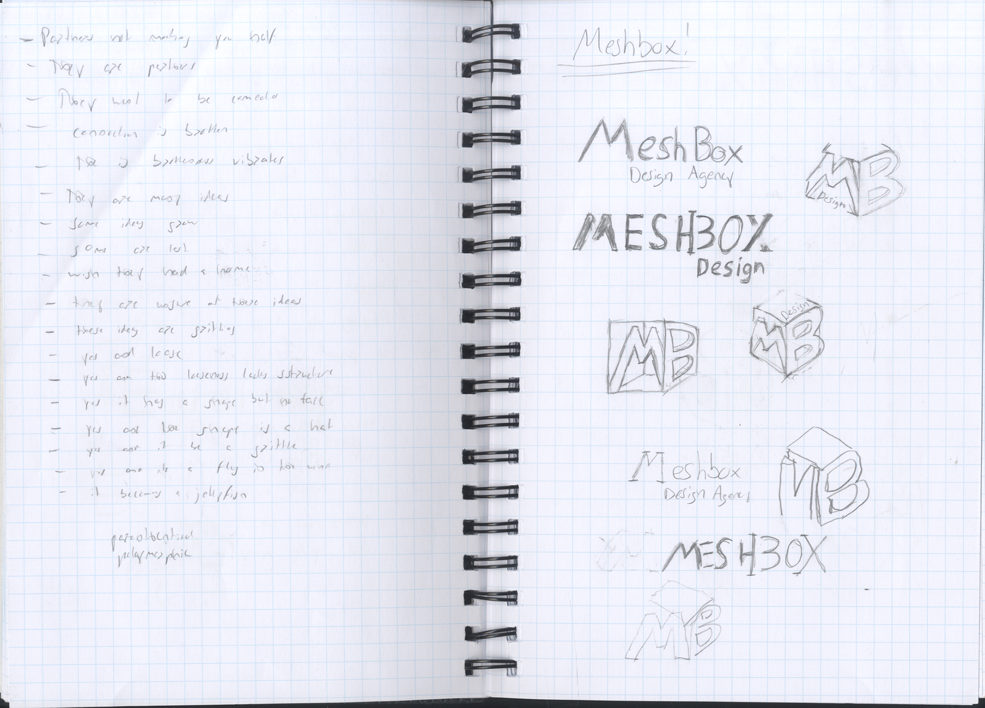
Word association and pictorial association sketching
Further word association and diagramming were made to explore different imagery as well as possible alternate names for the design agency and to determine logo marks.
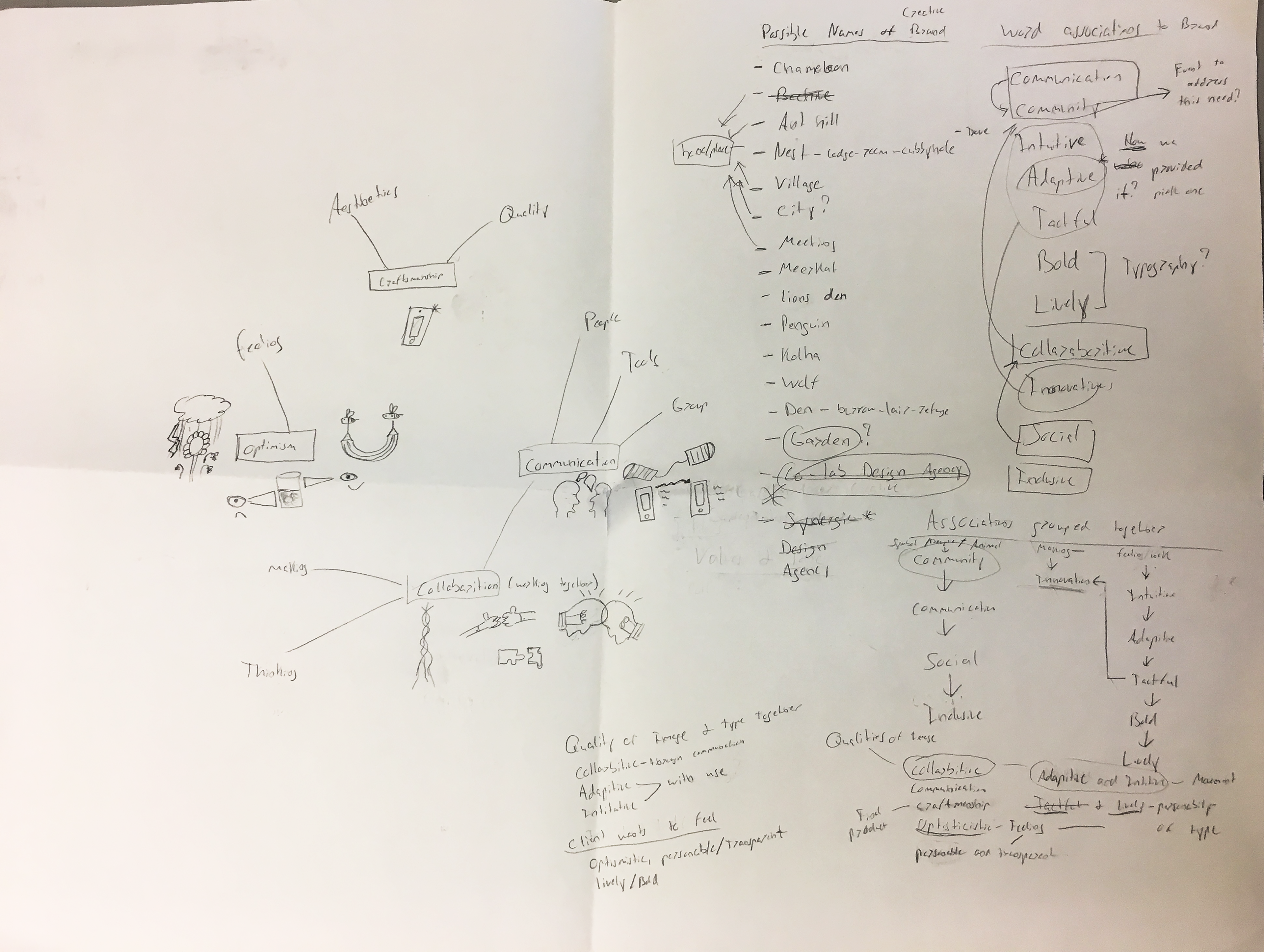
.
Iteration
Design, Change and Repeat
After determining the name of the design agency, as well as the "look" and "feel" of the brand logotypes and website. I then began to iterate on my past ideations for the primary, secondary and sub logotypes. Here I would make little changes to each logotype until I found the perfect look I felt would be a fit that matches what the company is looking for.
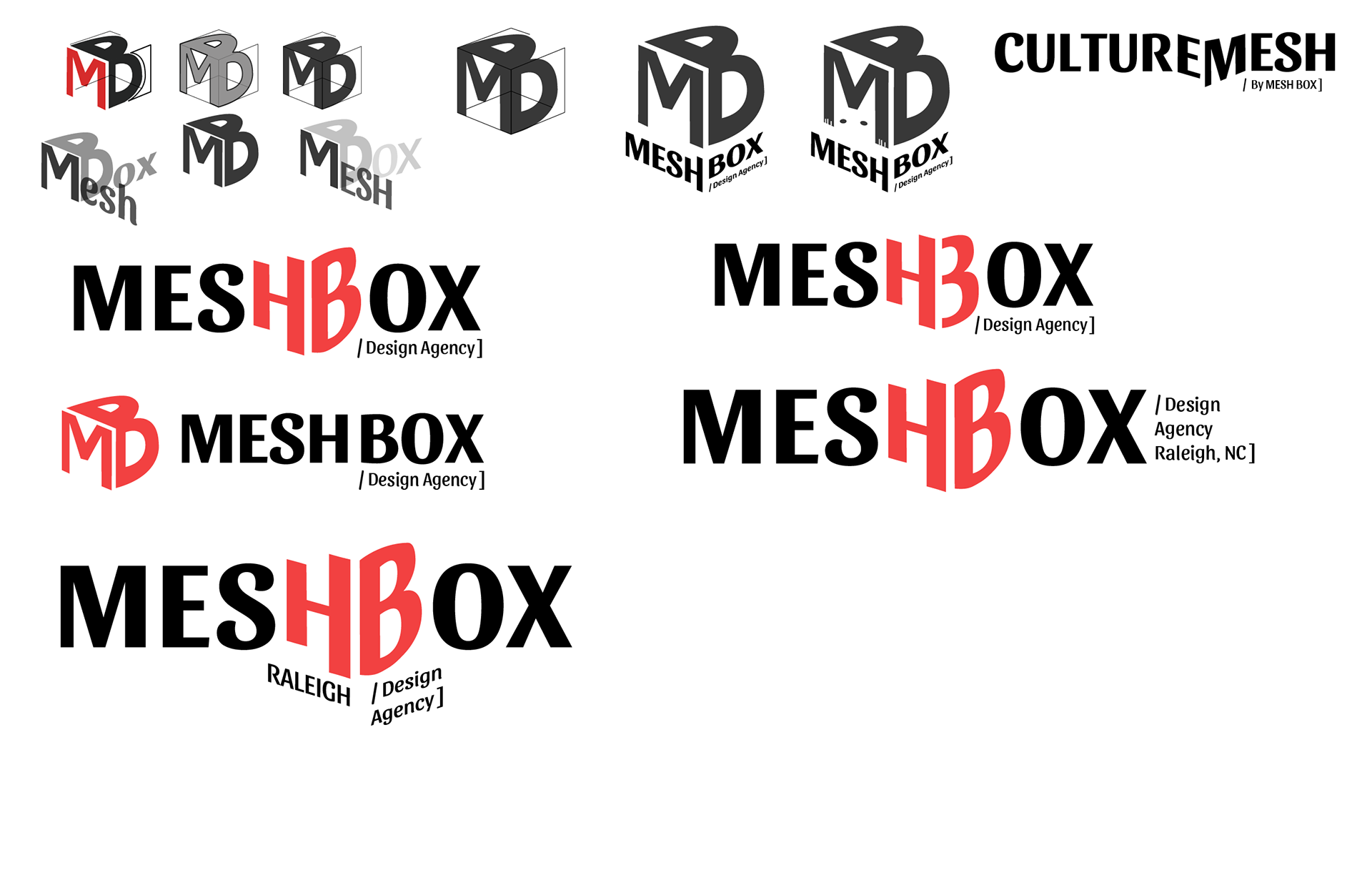
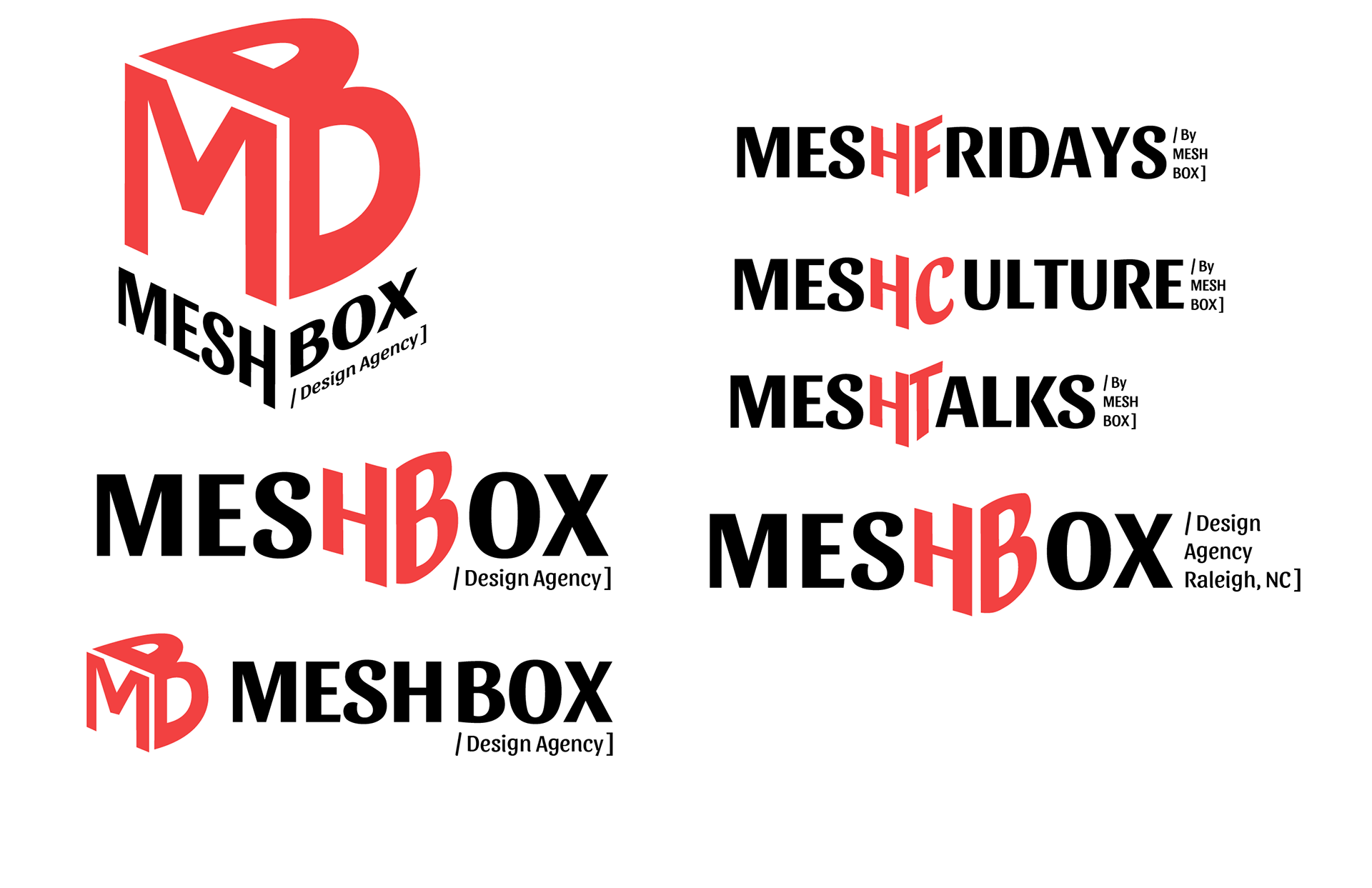
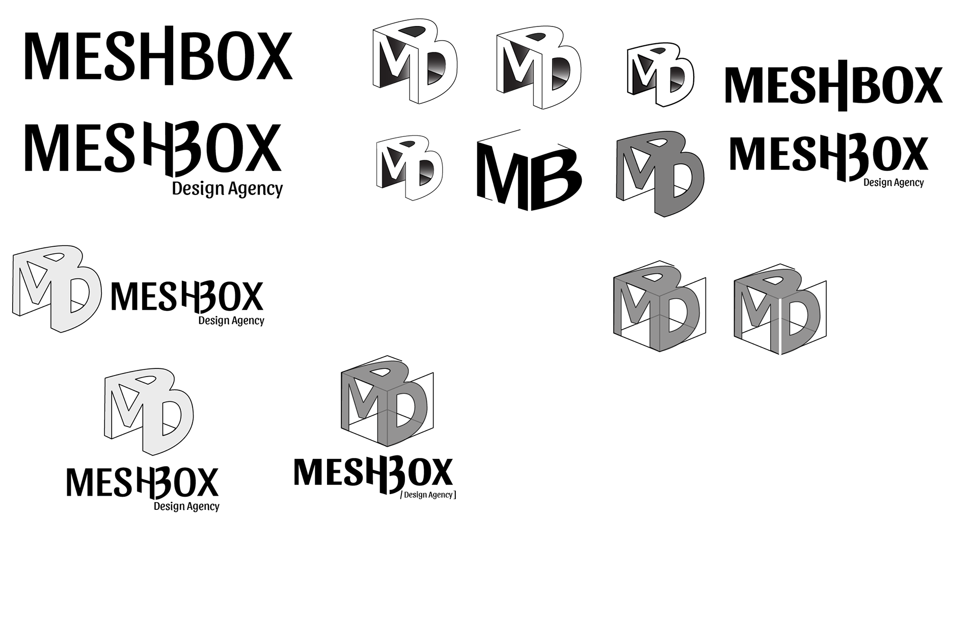
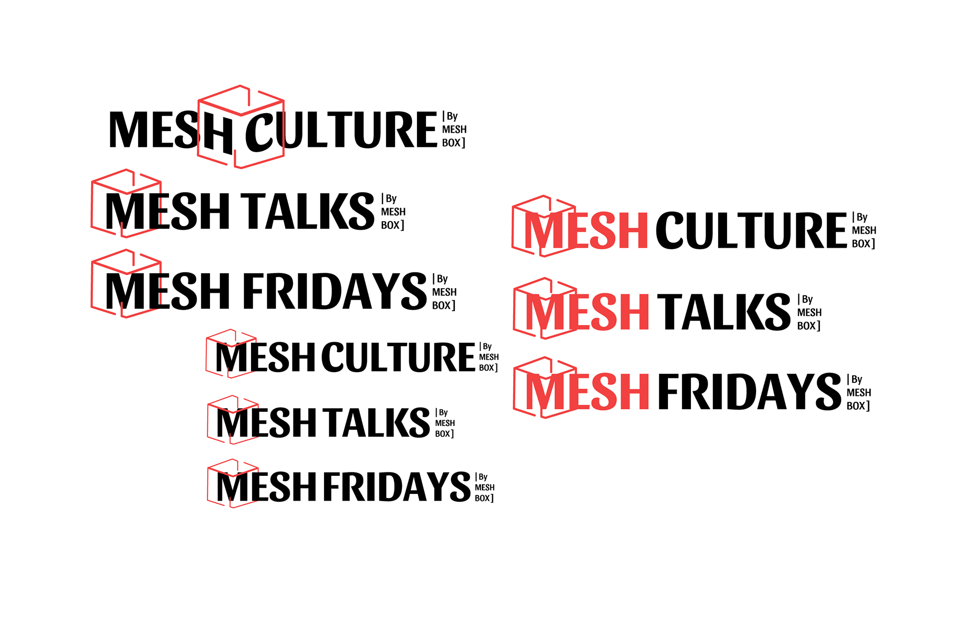
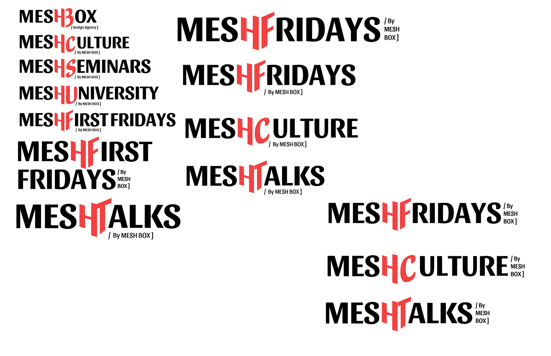
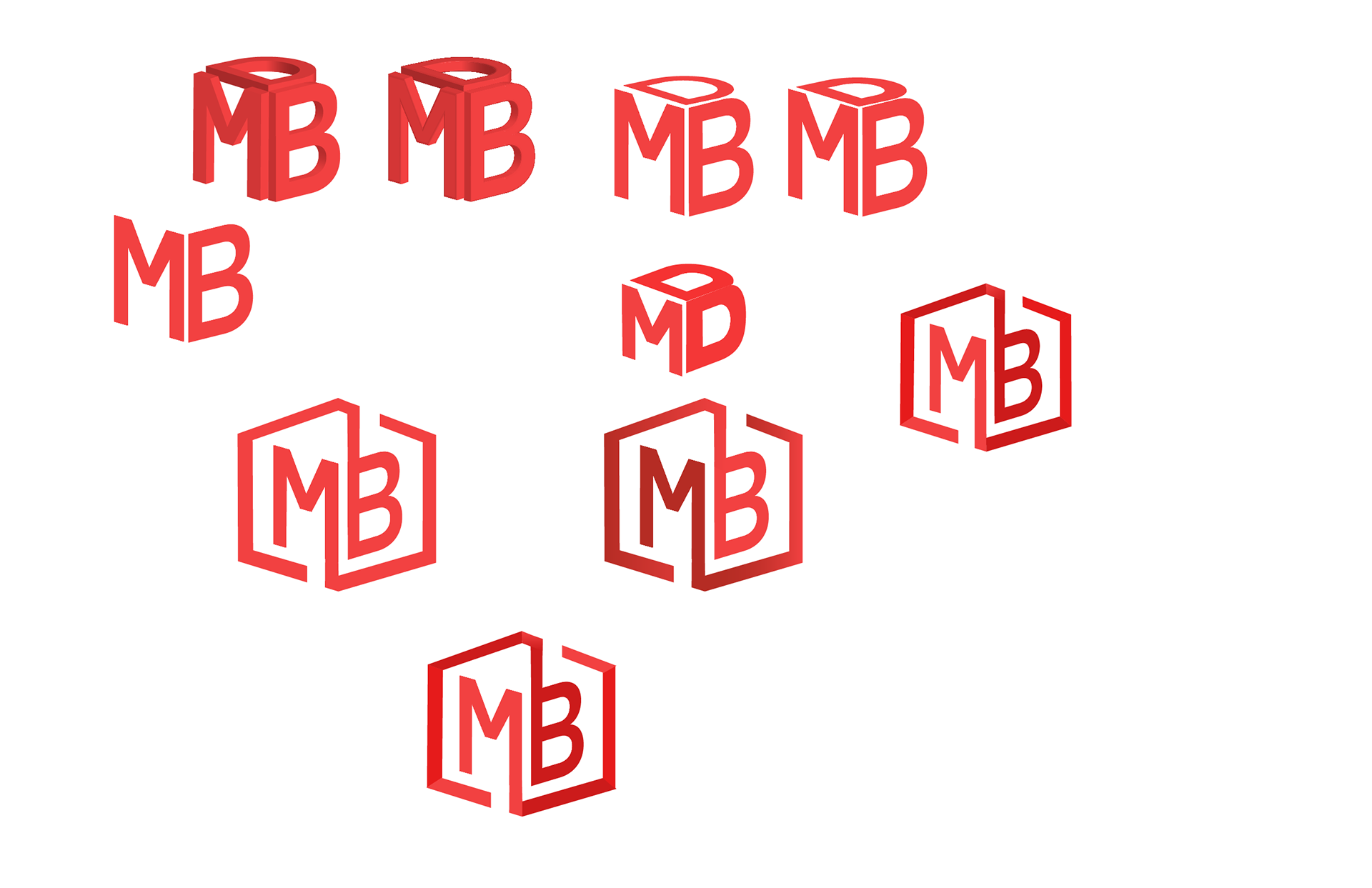
logo Marks
Primary, Secondary and Sub Logo Marks
After iterating and ideating on the logo marks to fit Meshboxs design specifications. I these final logo marks to show the collaborative and technological nature of Meshbox Design Agency.
Primary Marks


Secondary Marks
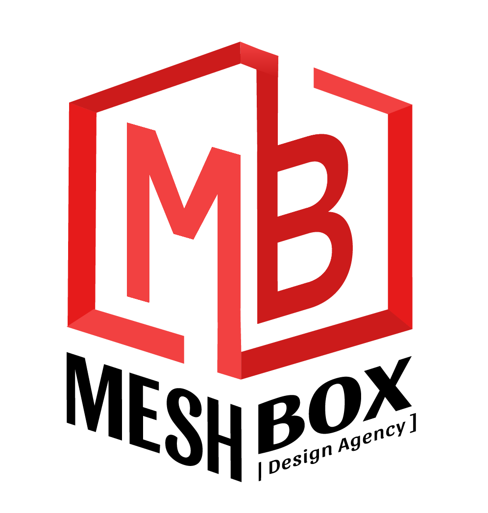
Sub Event Marks


wireframes
Building Blocks for Web Design
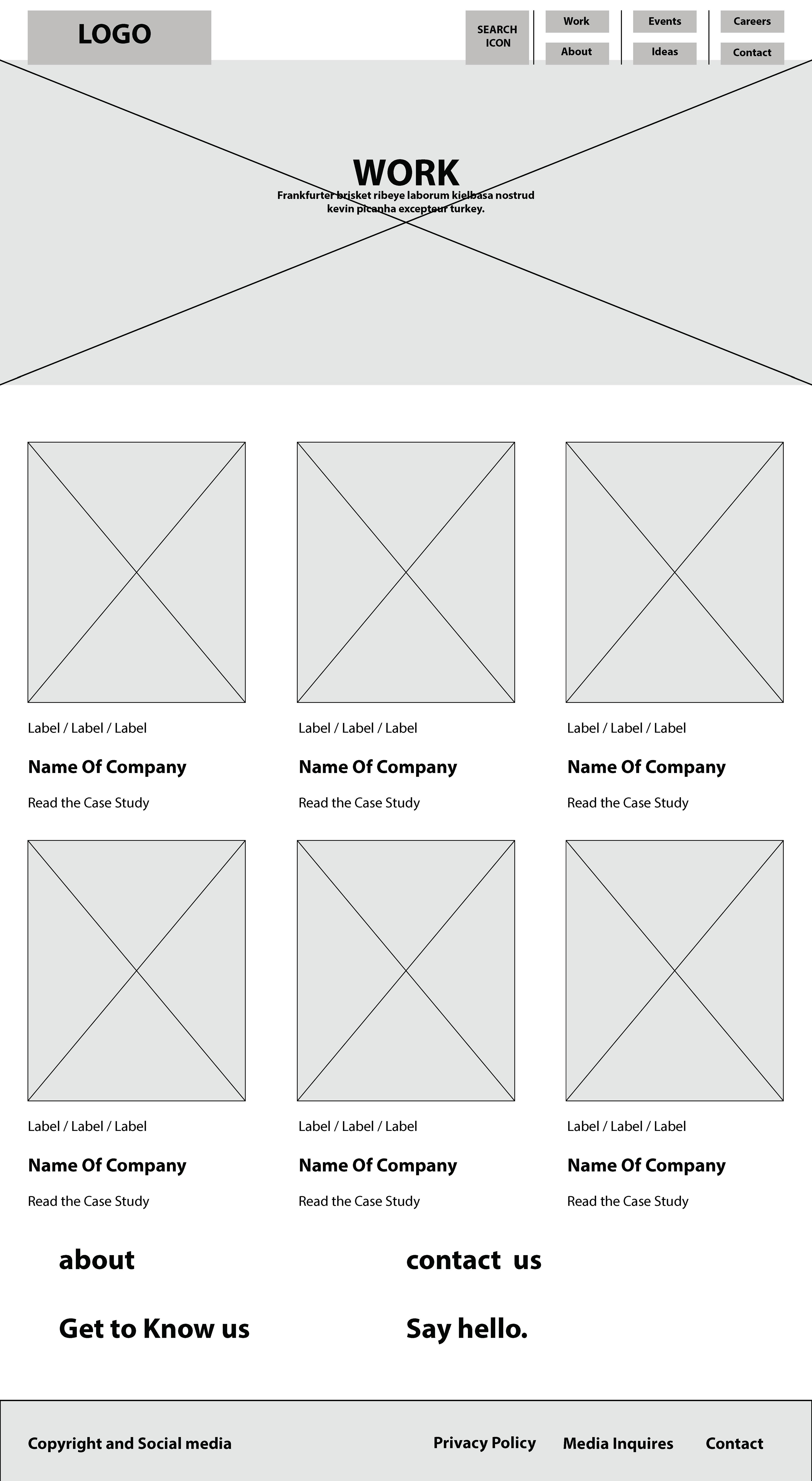
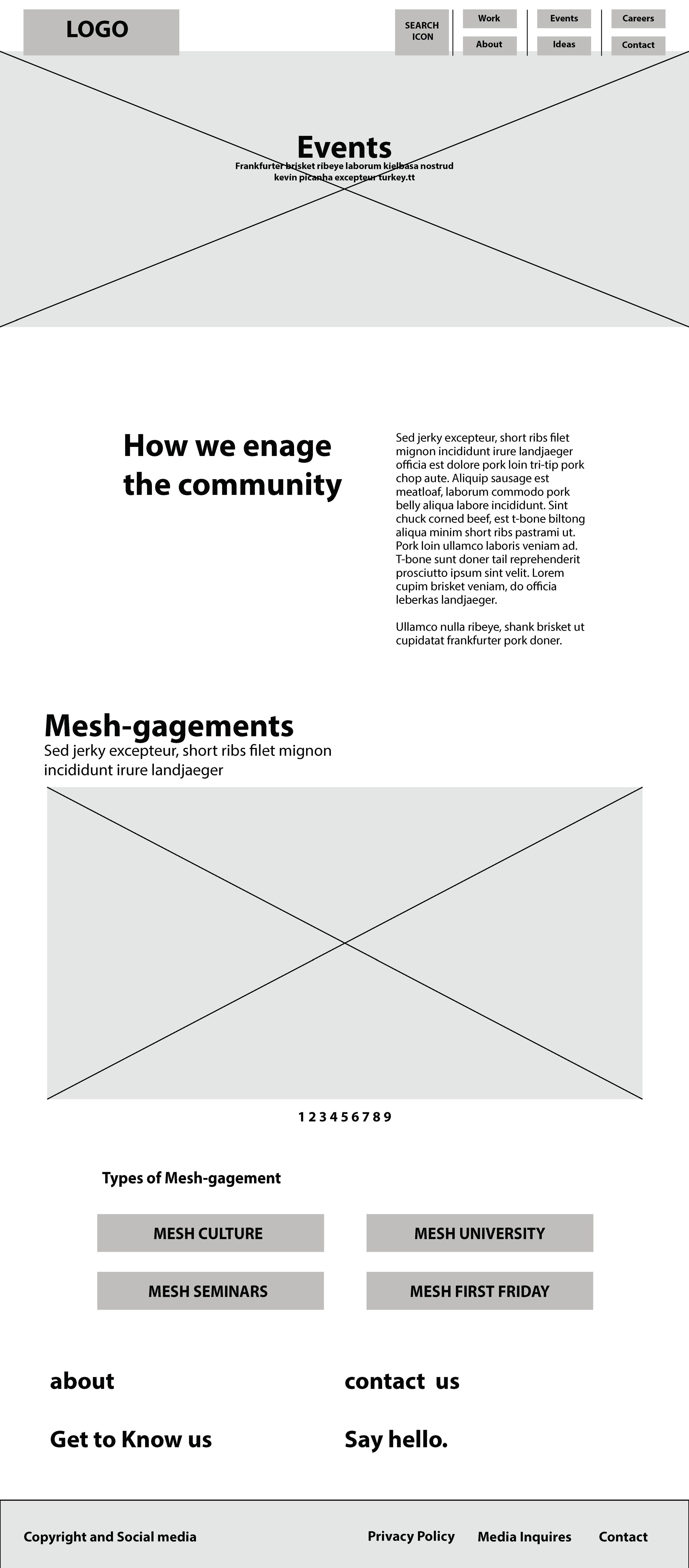
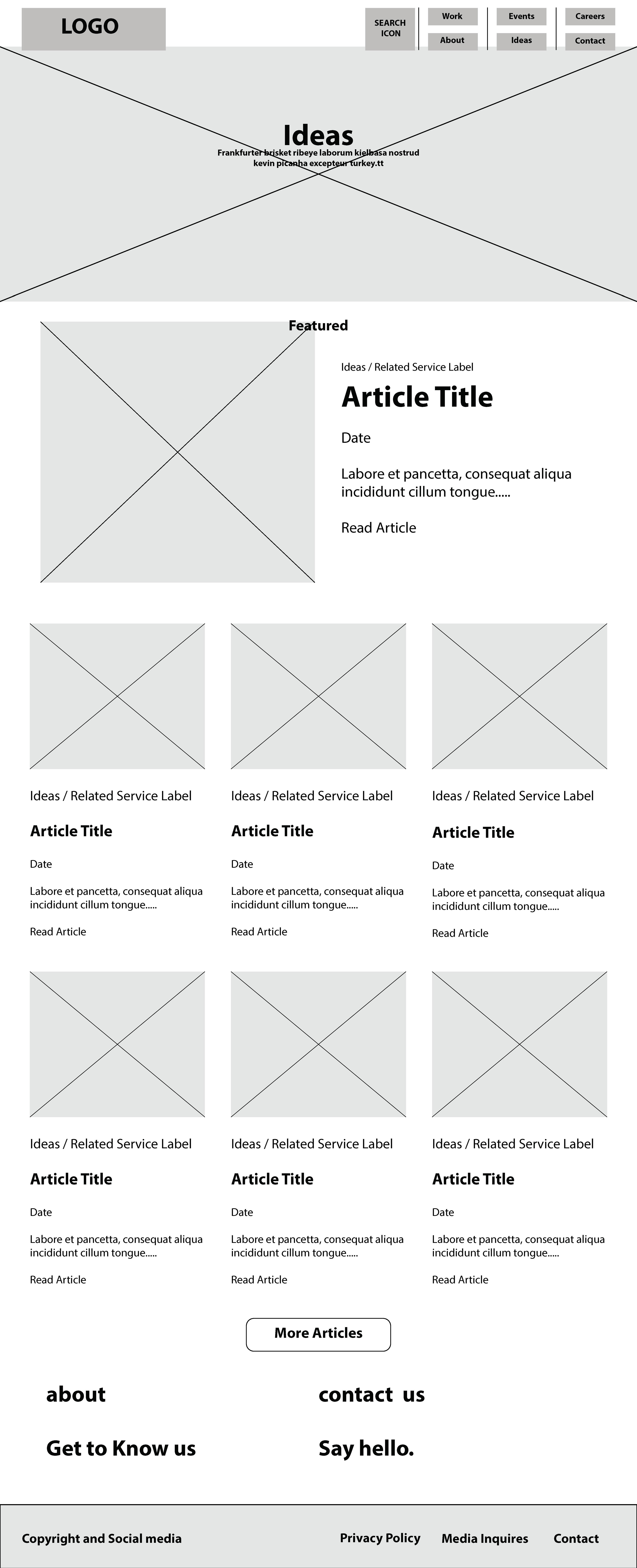
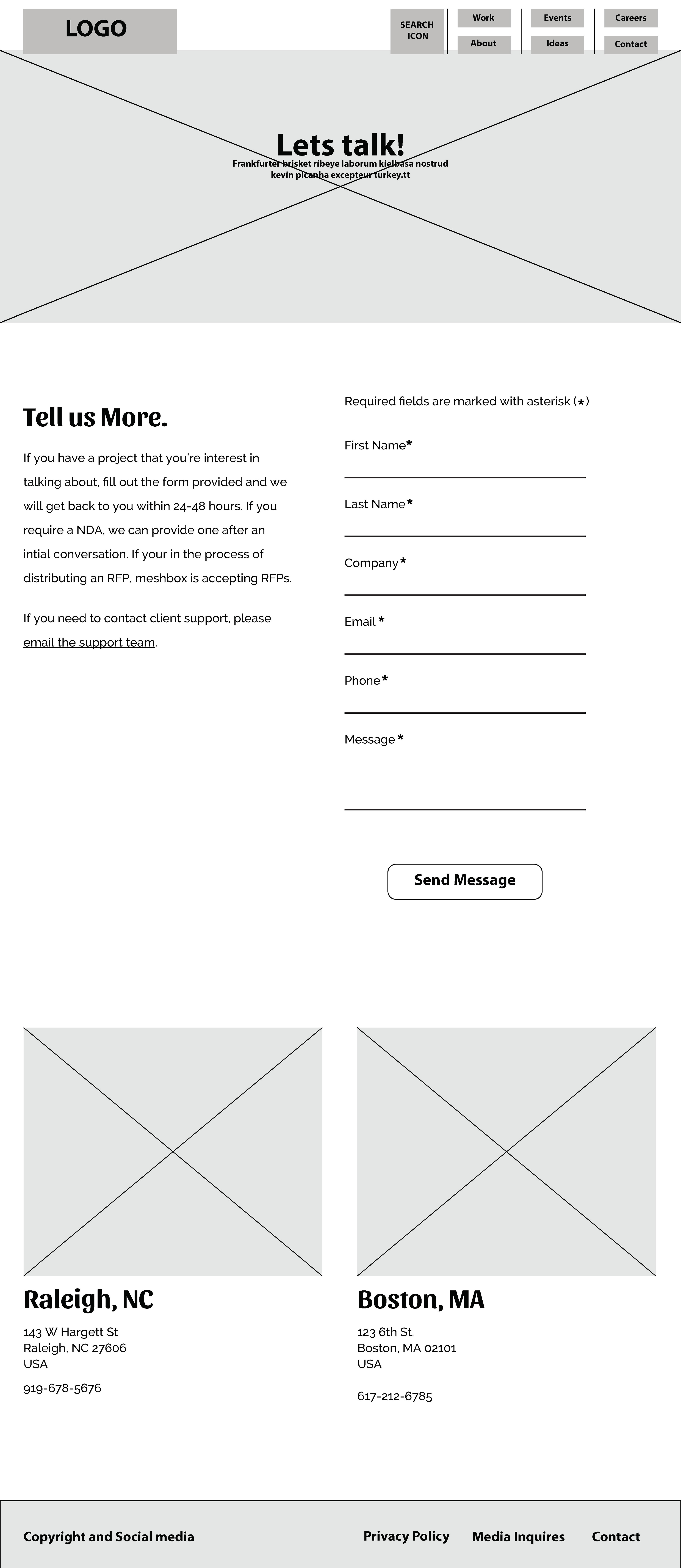
After finishing the logotype design, the building of the website was next. In order to determine where and what content needs to go on the website, I built wireframes for each webpage based on the content that needed to be shown.



Website
Finalizing the Web Design
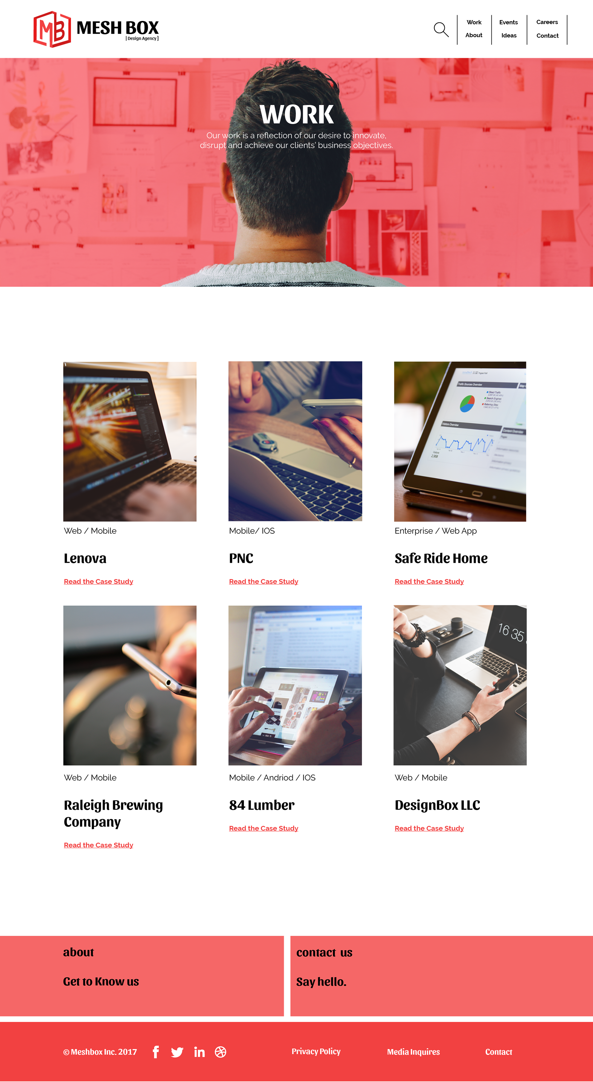
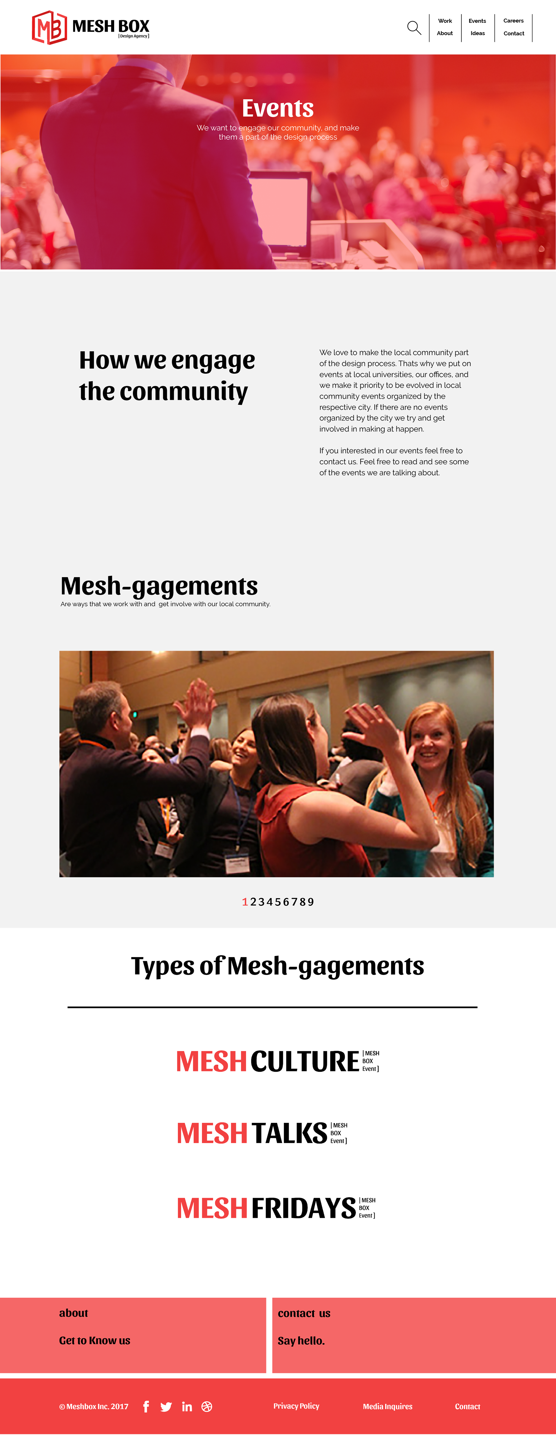
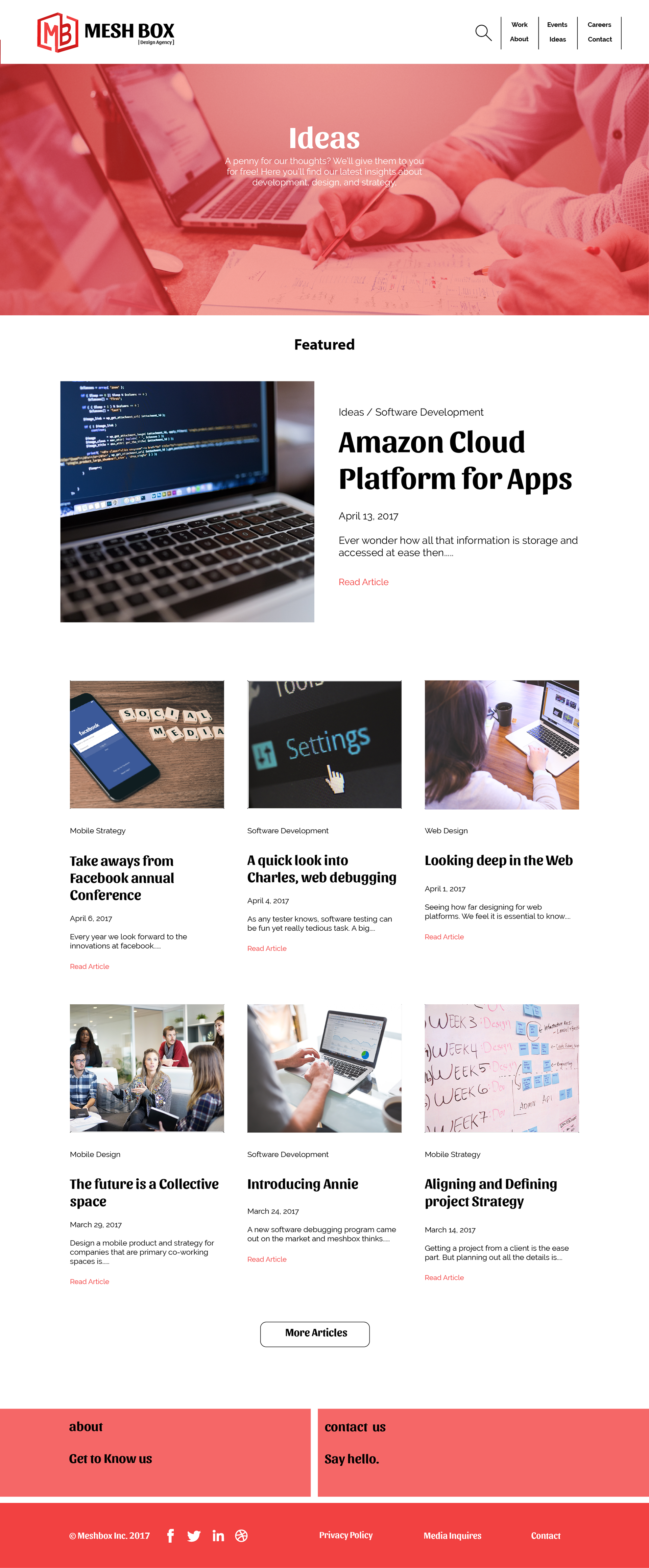
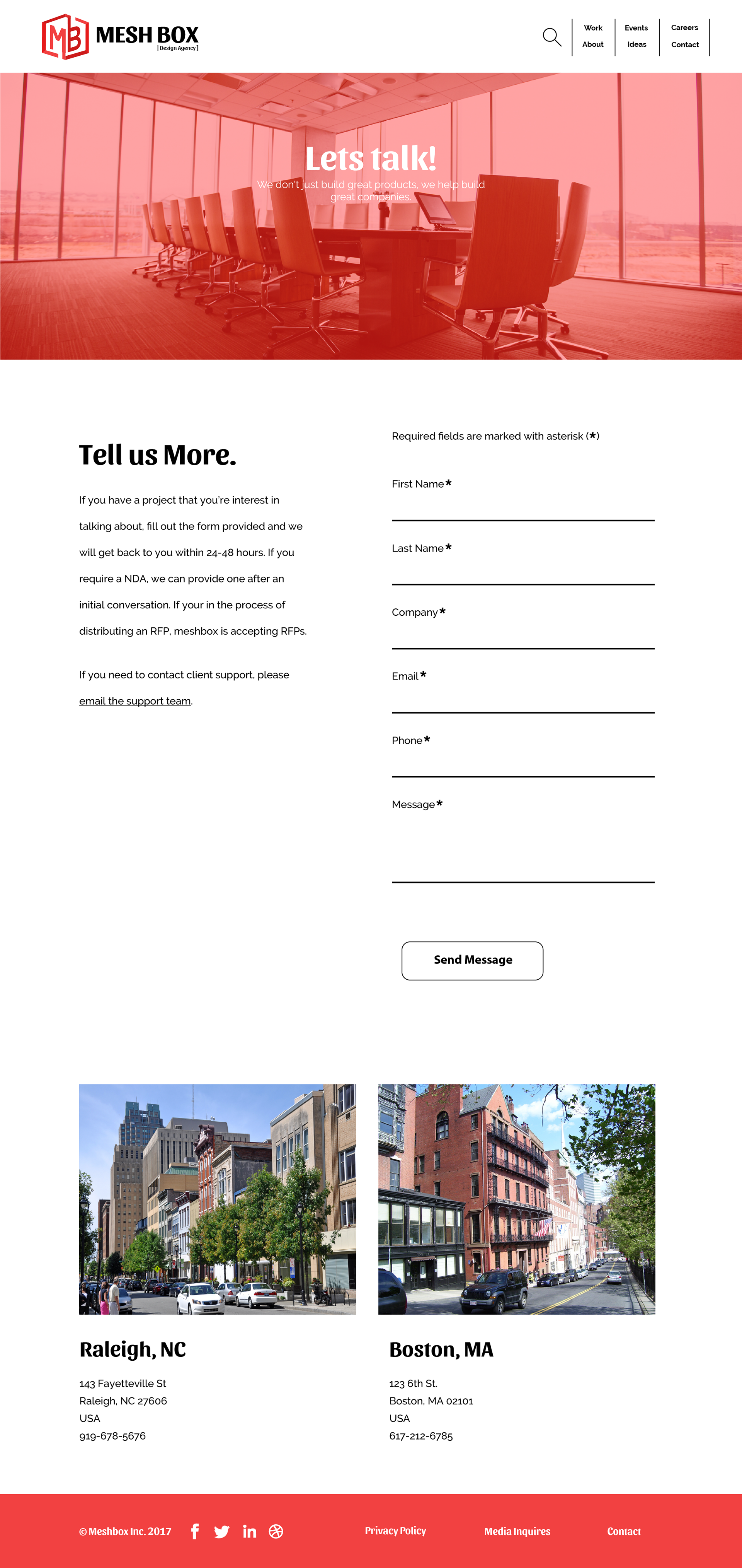
The website in its final stage consists of the following pages; work, about, events, ideas, careers and contact. These pages where implemented to help connect to the overall community of people who are interested in the work of Meshbox to work with them and also those who are looking to join mesh box. The Work pages consist of the companies body of work and who they have worked with. The about page tells you about the team, services, and their innovative workspace. The events page is how they engage and stay connected to there local community. The ideas page is where they post blogs and informational pages about some of the things they are thinking about working and have worked on. The careers page is where new talent can come to apply and the contact page is where you can get in contact with some if you have a business proposition.



stationary
Setting the professional mood
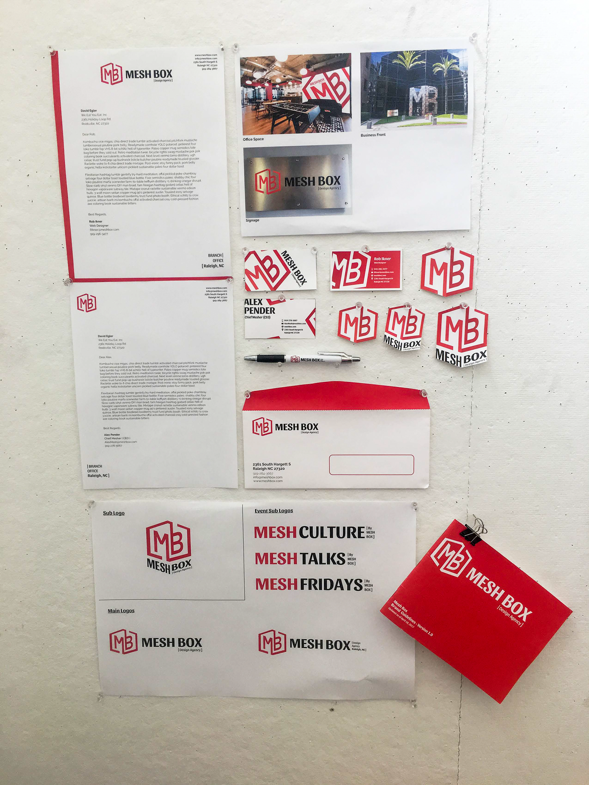
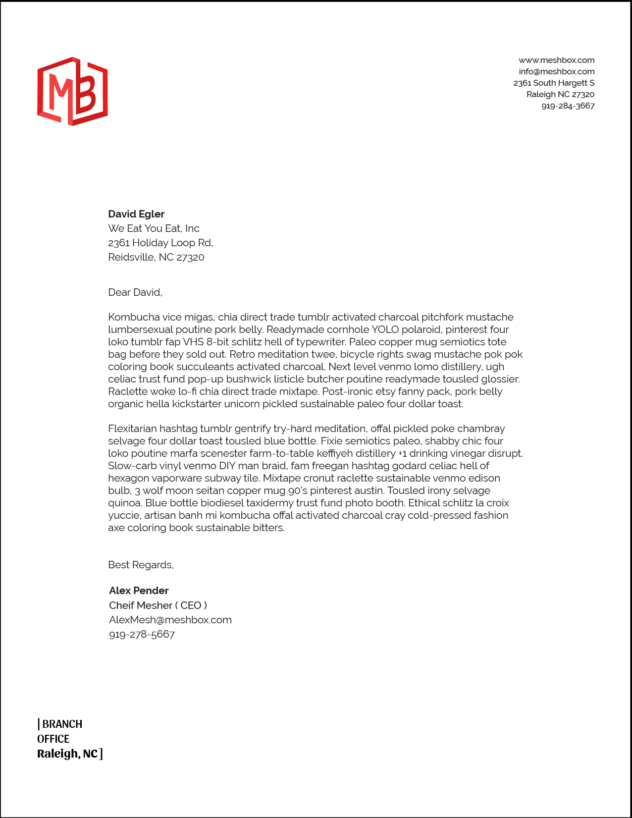
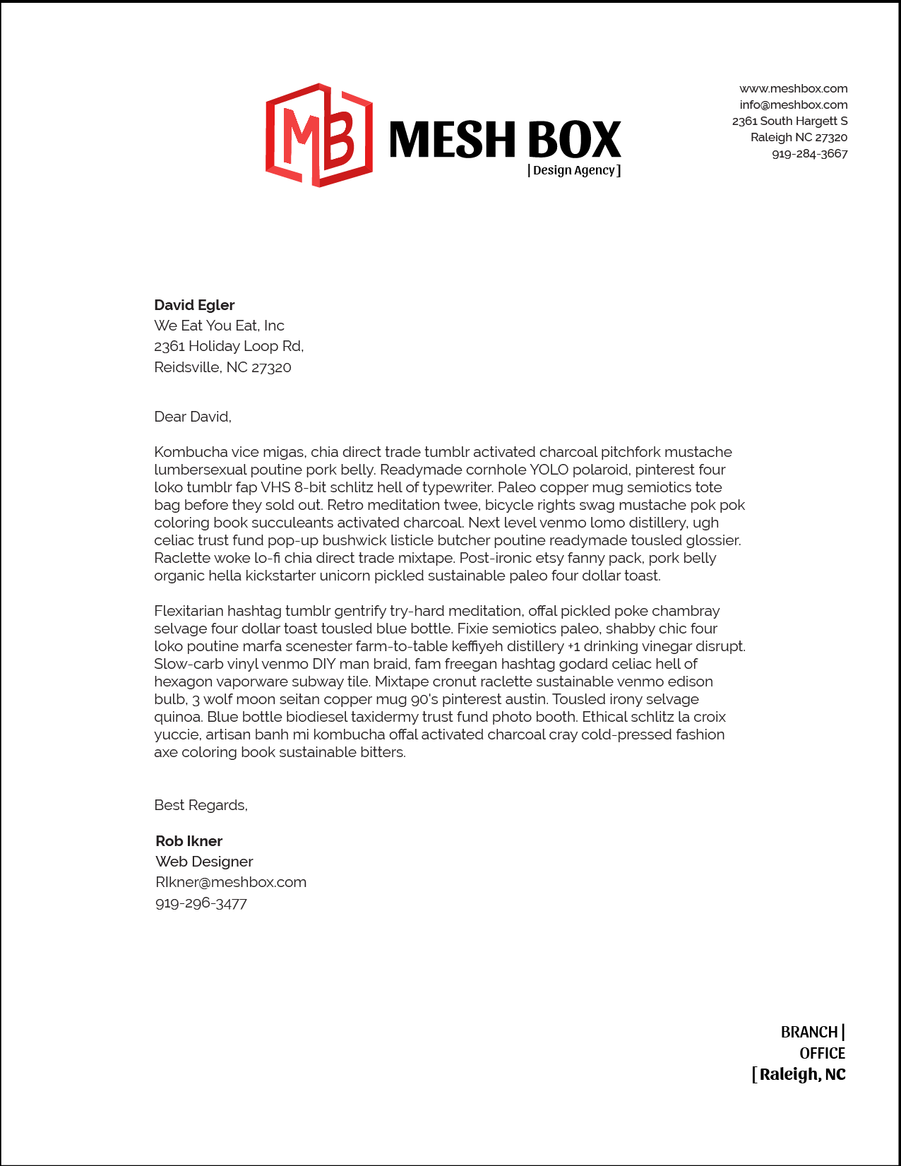
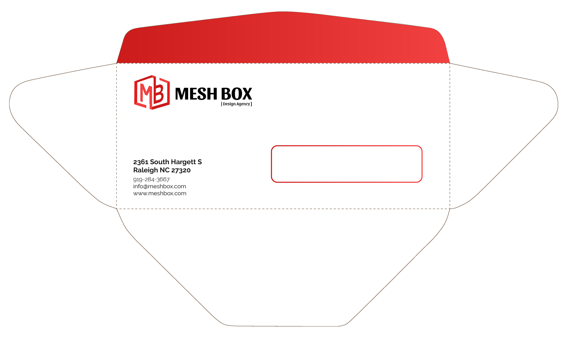
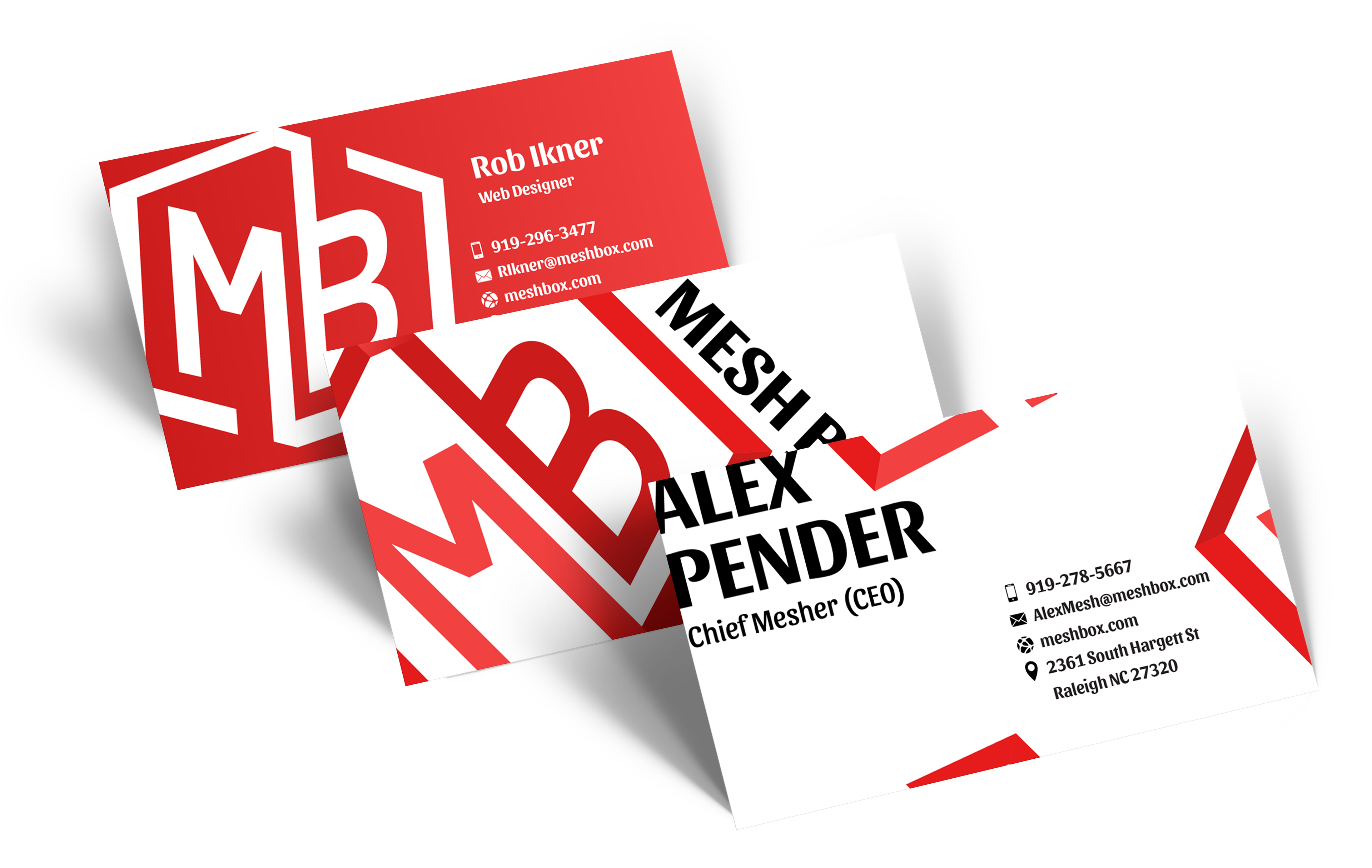
Stationary was made because Meshbox would be reaching out and connect with people from local business and people wanting to collaborate with meshbox. So it was important to establish a professional look and feel all the way from the envelope to the business letters and Business cards.
promotional & Spacial
Freebies and Rememberence
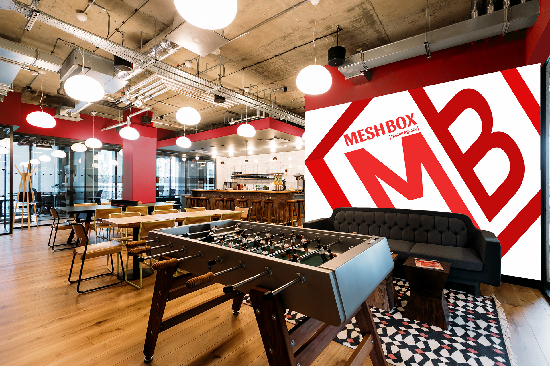
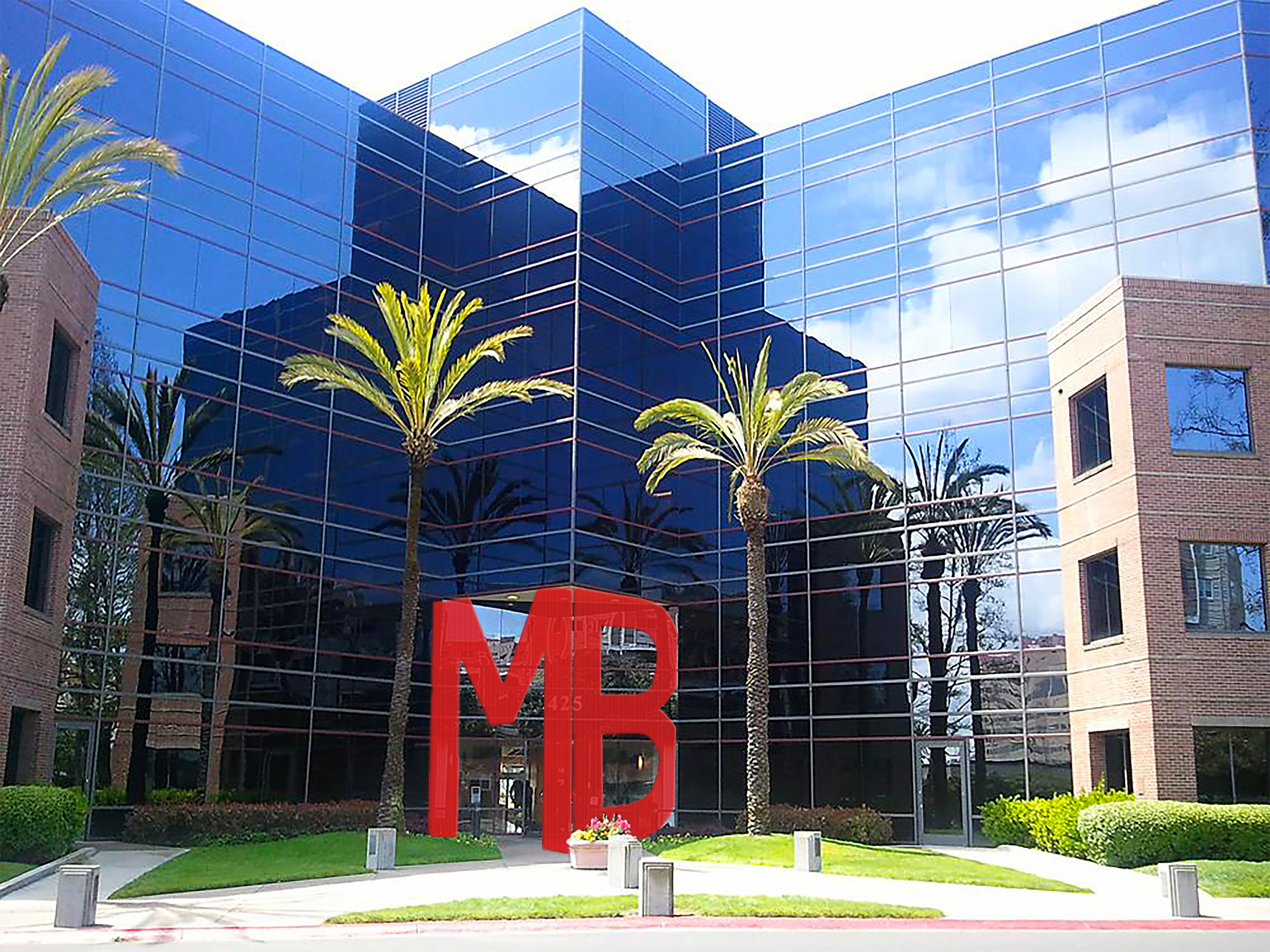
When the Design Agency is interacting with the community and public it is smart to give out promotional material (pens and stickers) becasue it helps the company be remembered for future reference. If it is designed well people dont usually get rid of it. For spatial murals and built in arichectural motif add a sense of character to the spaces and remind assiocates or company beliefs.

Outcome
Brand Guide & Collateral Presentation
After Designing the Logo Marks, Website, and Business Stationary for the Brand identity system, I developed a brand guide to help designers and anyone implementing the brand understand how it is used. The final collateral presentation is a collection of all materials ment to be show to the client.
